My website – the one you’re reading right now – is, in many ways, a family member to me. I know it seems a little weird, borderline crazy, to refer to a website as a family member…but hear me out.
It gives me an immense sense of pride and accomplishment. It provides sustenance. And, much like what happens to you when you’re crazy Aunt Jane comes to visit, it can drive me batshit crazy sometimes.
This site has gone through several iterations and “face-lifts” through the years, and I’d like to use today to describe the journey as it’s a topic I am often asked from other fitness professionals:
– Why did you start it?
– How’d you do it?
– When and why did you decide to hire someone to make a customized site?
– What were the advantages (and disadvantages) of doing so?
– How long did you clench your sphincter when you realized how much it would cost?
I hope this helps.

Should You Invest In Your Own Website?
I believe the short answer here is a profound “yes!” Paying for (investing) in having a website professionally made is, in a roundabout way, a way of investing in yourself.
However, I could just as easily say “it depends,” and/or “only when the time is right.”
Out of the gate I don’t believe most need to worry about hiring someone to make them a customized site; at least not right away. The ROI just isn’t there when you only have a handful of clients to begin with and the only people reading your stuff is, well, lets be honest, your mom is the only one….;o)
I do feel it’s important for people to have access to you, though. Meaning, I think it behooves any fitness pro to have a generic website that explains who you are, your experience, maybe take the time to describe your ideal client, as well as your contact information.1
If you really want to throw people for a loop maybe include a video of you doing an interpretive dance to an Adele song. I don’t know, I’m just spit-balling here.
My First Website
Your first website doesn’t have to be all fancy pants. My first site was something I jimmy-rigged from Blogspot.com. I think it’s called Blogger.com now.
NOTE: there are plenty of free website to help you get started nowadays: WordPress, Medium, etc.
The main selling point was that it was free, idiot proof, and I could pick from several templates to get things up and running quickly.
It was 2006 and I had just started getting several articles published on T-Nation.com, so of course I needed my own website goddammit. You know, cause I was someone important and had important things to say.
I signed up for a free account and within minutes I had my very first website.
Regrettably, wading in a pool of my own bravado and naivete, I named my freshly minted website, of all things, “The G-Spot.”
My last name started with “G,” I thought it was witty, and there’s a reason why I never went into marketing. I’m sure if someone dug deep, they’d be able to find it.2
This all happened within a few months of me having moved to Boston right when I had started working at a posh club downtown. During my free time between clients I’d head to the cafe and write maybe two posts a week, mostly concentrating on common myths and misconceptions I’d come across via conversations with them:
- Why Sit-Ups Are a Bad Idea
- Did You Know Deadlifts Mold Badonkadonks?
- Why Squats Are the Awesome
- No, You Existential, Metrosexsual Douche, HAN SHOT FIRST
Alas, the “G-Spot” served it’s purpose. It allowed me a place to hang out with myself, an opportunity to practice my writing, and served as a “home base” for people to get a hold of me.
The Step-Up Blog
My big “blogging break” came a few months after starting The G-Spot. I had started working with a client who worked at the Boston Herald and she mentioned to me they were looking for someone to provide online content for their health/fitness blog.
She asked if I’d be interested, I said okay, and internet history was made.
Well, not really.
I did grow the “Step-Up” blog to one of the more frequented blogs on their site, and ended up staying there for close to two years, writing 3-5 posts per week. It was an awesome experience and definitely gave me some added prestige to be affiliated with a known brand.

During that time I continued to write for T-Nation, started getting courted by places like Men’s and Women’s Health3, and also helped start and co-found a little ol’ gym called Cressey Sports Performance.
Things were going well and it soon dawned on me it would work in my favor to start writing for myself again, on my own site
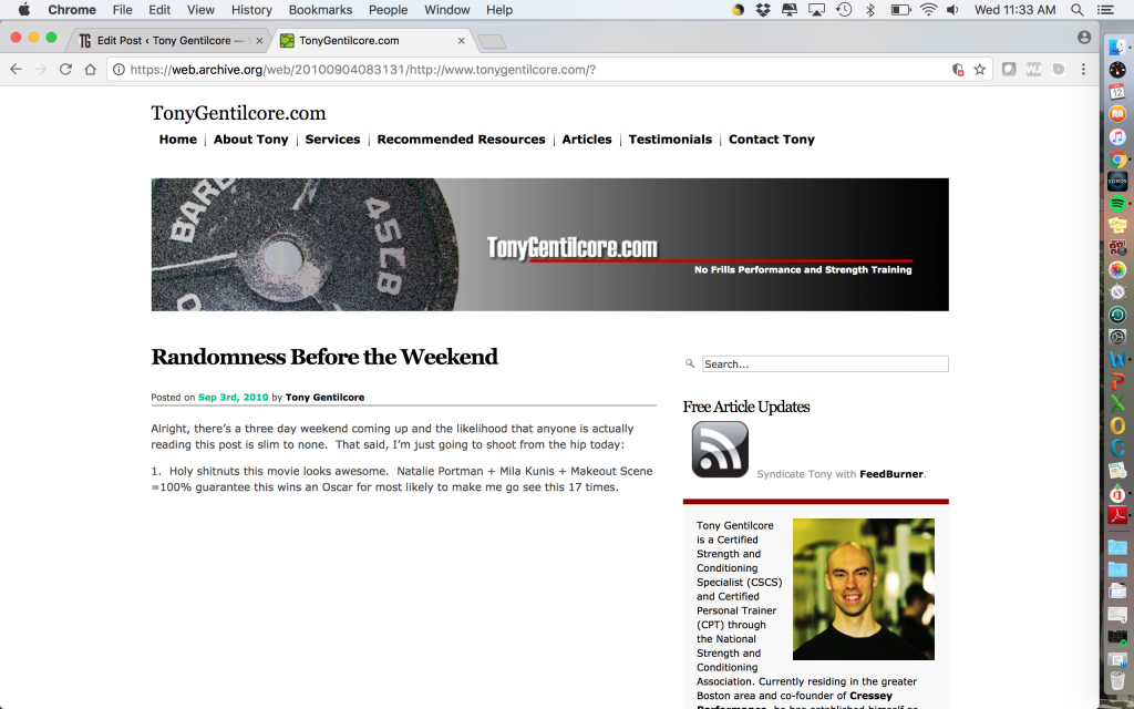
TonyGentilcore.com – #1
I still wasn’t at a point where I felt I needed to hire someone to customize a site for me. But I also recognized I didn’t want some vanilla looking site that looked like everyone else’s.
What to do, what to do?
I ended up trade-bartering services with a friend. I was good and making people diesel and he was good with 0’s and 1’s. I offered to write him several months of programming in exchange for a website.
BOOM.

Again, nothing too fancy…but a step above what most people had at the time. I even took the picture of that weight plate on the home page. No big deal.
My “homepage” was the blog itself, but I also added tabs like “Services,” and “Recommended Resources.” The latter two, in addition to the blog, allowed me a little more opportunity to monetize the site, which was a goal of mine all along.
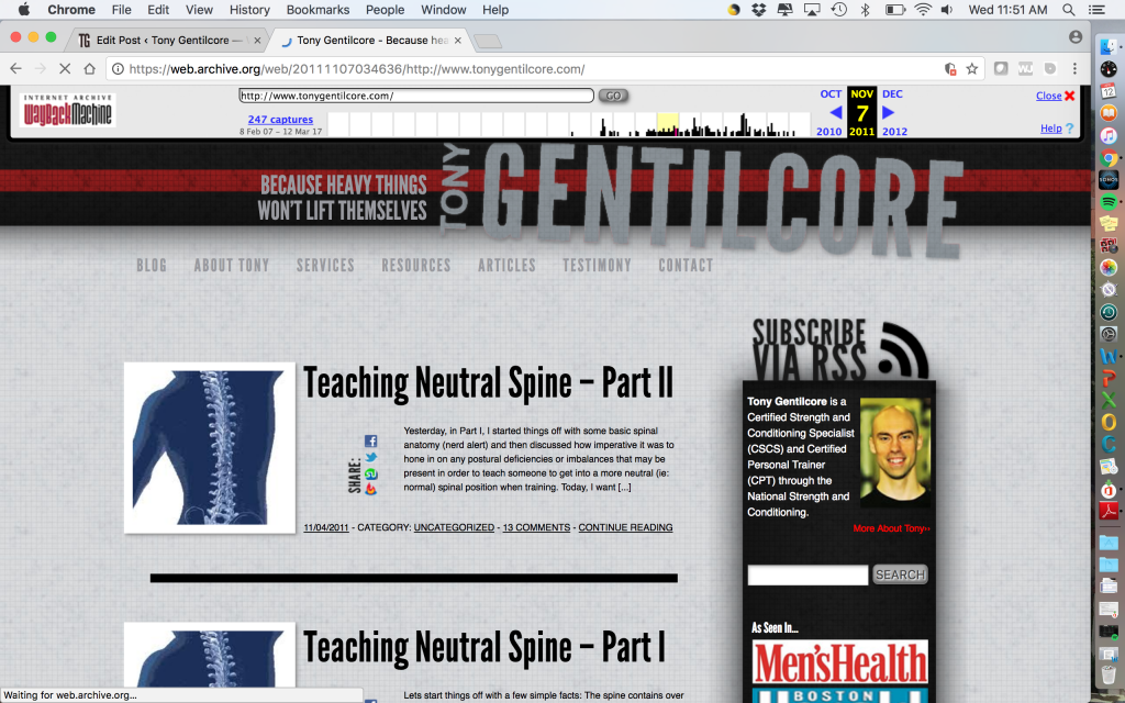
TonyGentilcore.com – #2: When Shit Got Real
In 2009-2010 I decided it was time to put on my big boy pants on and hire someone to make a customize website for me.
At that point I had accumulated close to 5+ years of content and my blog was starting to become a legitimate added source of revenue via affiliate income and distance coaching inquiries.
I figured if I wanted to take my site to the next level I’d need to make it stand out. I reached out to Copter Labs, and they produced this gem:

It consisted of many of the same functions/features as the previous website, but looked way sexier and appealing, and had all the bells and whistles to boot.
It wasn’t cheap – to the tune of a few thousand dollars.
Whaaaaaaaaaaaaaat?
Putting things in perspective, though, I had reached a point in my career where investing in myself seemed a wise move.
You know the saying “you have to spend money to make money“?
It applied here.
The design and features alone weren’t the selling point for me, nor is it where I felt I received the most value.
It was the BENEFITS they provided.
First off, I have no effing clue how to make a website. I can barely run a microwave without blowing up my apartment.
Many companies make beautiful websites, but why I chose Copter Labs was because I knew they knew the fitness market.
Moreover, I knew they’d take care of every detail from the photography to the general functionality of the site.
It’s something I heard Mike Samuels write about recently:
“No one gives two shits about features.
What people care about is the BENEFITS.
What’s the specific outcome they’re going to get?
I see this a lot when I talk to clients for the first time.
You ask them why people should buy their product and they say things like –
– The design is incredible.
– They get a different task every day
– I only use the finest ingredientsOkay. Cool.
None of these are bad, but none of them compel people to buy either.
They’re very ‘nice’ … and nice is the most abhorrent, repugnant, obnoxious thing to be.
If you TRULY believe that these features matter, then run the ‘so that’ test on them.
For example –
‘The design is incredible SO THAT this course is much easier for people to follow than any other on the market.’
“I only use the finest ingredients SO THAT the meals stay fresher for longer, and taste so much better than generic, crappy microwave meals.”
However, this isn’t to short-change the importance of a baller design. I DO feel it matters, especially now, in an age where everyone is vying for everyone else’s attention.
I think one of the biggest things people don’t pay attention to is the value of design. A well designed website, visually appealing / aesthetically pleasing, one that stands out from the crowd, one that doesn’t look like it was built on top of a template, can, and almost always will separate you from the masses
[IMPORTANT NOTE: Assuming, of course, your content doesn’t suck]
People can tell the difference and know when they’re visiting a poorly designed website. What’s more, they can tell how it “feels” while using the site. It may seem low quality, hard to use, disorganized.
What’s the point of this site?
While it may seem obvious to the business owner, it’s never that obvious to the site’s visitor.
How does a potential client find what they’re looking for? Do they have to work at it, click a bunch of links and read through a bunch of unorganized copy? The site’s design and structure should lead them right to their answers.
A template can’t design a website for you. A site builder platform can’t either. Just like an app can’t be a personal trainer, an app can’t be a web designer either.
TonyGentilcore.com – #3
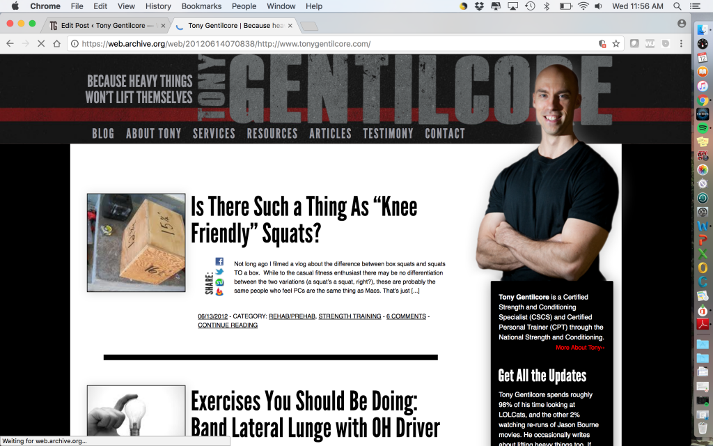
Maybe a year or so later I hired Copter Labs again to give the site a bit of a face-lift.

A crisper look to say the least.
And, what can’t be appreciated by a screenshot alone was the “flow” of the site. That was improved as well. If you had the ability to scroll down on the picture above you’d see an area to sign-up for my newsletter as well as links to all my social media accounts.
Flow is crucial.
It didn’t (and doesn’t) take a rocket scientist to navigate the site. If you wanted more info on me and what I was about you’d click the “About Tony” tab, if you wanted to read more articles I had written, you’d click “Articles” tab, or if you wanted to hear a cacophony of hip-hop horns all you had to do was click on my left forearm.
The ultimate Easter Egg.4
TonyGentilcore.com – #4
Is what your eyes are transfixed by today.
The last update was back in 2014 and at that time I had ZERO idea my site wasn’t compatible with mobile devices and tablets. I had noticed a slight drop in traffic which resulted in me eating more Ben & Jerry’s Ice Cream and watching Julia Roberts’ movies. It was a dark time in my life. I don’t want to talk about it.
Here I was thinking I lost my blogging mojo and that I should just give up and become a crazy cat lady, when the real issue was there were a fair number of people unable to read my site because they weren’t able to access it via their mobile devices.
Giving credit where it’s due, Copter Labs were a head of the curve, recognized the snafu, and went in and fixed it…amongst other things, like, connecting an email marketing platform to build targeted audience segments, and helping me to plan out a more diverse e-commerce section in the near future.
And, possibly, a photo gallery of my cat.
In reality, the site is always a work in progress. I am constantly tweaking this and changing that. And that’s the beauty of it: while the shell is 100% customized to me and my goals for the site, the deeper levels – adding services, speaking engagements, new resources, etc – are what I have control over at all times.
That’s That
This isn’t a love-letter to Copter Labs. And just to throw it out there I receive zero kickback from mentioning them.5
I wanted to write this today because it’s something I am constantly asked by many fitness pros, young and old, and I wanted to share my experience(s). I DO feel there’s value in hiring someone to customize a site for you, but would caution people to do so too quickly before they’re ready.
But if you are going to do it, there’s a lot of shady people out there. I’ve heard several stories of people spending several thousand dollars on website developers only to be disappointed, or worse, left empty handed.

I wouldn’t steer you in the wrong direction. I got your back. If this is something you’ve been on the fence on, consider my peeps at Copter Labs and give them a shout. They’ll take good care of you.
I’m out.
- It seems obvious, but you’d be surprised how many people forget this.
- If you do, I’m sorry.
- Well, not so much “courted” as it was me pestering them “can I write for you, huh, can I, can I?
- Just kidding, this wasn’t a thing. But it should have been. Goddammit, it should have been.
- Although I wouldn’t say no to a few tickles.


